PREPINSTA PRIME
Line Chart Formulas
Formulas for Line Chart
Here , In this Page Formulas of Line Chart in Data Interpretation is given along with some questions and answers.
A line graph is a graphical display of information that changes continuously over time. A line graph may also be referred to as a line chart. Within a line graph, there are points connecting the data to show a continuous change.
Formulas for Line Chart
Types of Line Chart
Data Series: In a line chart, data is represented as a series of data points, where each data point corresponds to a specific value at a particular point in time or along a continuous scale. These data points are connected by straight lines to form the chart.
X-Axis and Y-Axis: Line charts have two axes: the horizontal axis, known as the X-axis, and the vertical axis, known as the Y-axis. The X-axis typically represents the independent variable, such as time, while the Y-axis represents the dependent variable, which can be any numerical value.
Data Points: Each data point on the chart consists of a pair of values: one for the X-coordinate (horizontal position) and one for the Y-coordinate (vertical position). The X-coordinate is used to determine where the data point is plotted along the X-axis, while the Y-coordinate determines its position along the Y-axis.
Line Segments: The data points on the line chart are connected by line segments. These line segments provide a visual representation of the trend or pattern in the data. A continuous line typically suggests a smooth progression between data points.
Trends and Patterns: Line charts are particularly useful for visualizing trends in data. An upward-sloping line indicates increasing values over time or along the X-axis, while a downward-sloping line suggests decreasing values. A horizontal line suggests no change, and fluctuations in the line can reveal patterns or cycles in the data.
Title and Labels: A line chart typically includes a title and labels for both the X-axis and Y-axis to provide context and help the viewer understand the data being displayed.
How to make Line Chart?
To draw a line chart you must follow these steps :
- Use the data from the data-table to choose a suitable scale.
- Draw and label the scale on the vertical (y-axis) and horizontal (x-axis) axes.
- List each item and place the points on the graph.
- Join the points with line segments.
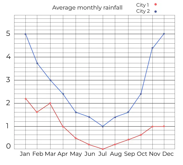
The above diagram shows the line graph of the average monthly rainfall of two cities (City 1 and City 2).
We can extract information from the above line graph and answer the questions accordingly.
Prime Course Trailer
Related Banners
Get PrepInsta Prime & get Access to all 200+ courses offered by PrepInsta in One Subscription
Question and Answers for Line Chart
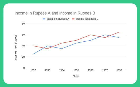
Study the following graph carefully and answer the questions given below (Profit is taken as the % of expenditure.)
Question 1 :
What would be the ratio of income of company B in 1996 to the income of company A in 1993?
Income of Company B in 1996 = 60 lakh. Income of company A in 1993 = 40 lakh. Required ratio = [latex]\frac{60}{40}[/latex] = 3:2
Question 2 :
Income of company B in 1997 = 55 lakh.
% profit = 10%
Expenditure = [latex]\frac{60}{1.1}[/latex] = 54.5 ⇒ amount of profit = 60 – 54.5 = 5.5 lakh
Question 3 :
Required expenditure = [latex]\frac{50}{1.25}[/latex] = 40 lakh
Question 4 :
What is the average of the income of A and B together in the years 19921 1993 and 1994?
A. 35
B. 36
C. 37
D. 48
Answer : 37
Solution:
Income of A = 22 + 40 +38 = 100
Income of B = 40 + 38 + 44 = 122
Average of income of A and B = (100 + 122 ) / 6 = 37
Question 5 :
Calculate how much percent income of A was more or less than the income of B in the year 1996?
A. 12.32%
B. 13.25%
C. 14.25%
D. 16.66%
Answer : 16.66%
Solution :
Income of A in 1996 = 50
Income of B in 1996 = 60
Clearly B has higher income.
Percentage less than B = (10 / 60) * 100
= 100/ 6 = 16.66%
Get over 200+ course One Subscription
Courses like AI/ML, Cloud Computing, Ethical Hacking, C, C++, Java, Python, DSA (All Languages), Competitive Coding (All Languages), TCS, Infosys, Wipro, Amazon, DBMS, SQL and others

Series
- Line Charts – Questions Formulas | How to Solve Quickly | Tricks & Shortcuts
- Pie Charts – Questions | Formulas | How to Solve Quickly | Tricks & Shortcuts
- Bar Charts – Questions | Formulas | How to Solve Quickly | Tricks & Shortcuts
- Radar Charts – Questions | Formulas | How to Solve Quickly | Tricks & Shortcuts

Series
- Pie Charts –
Questions |
Formulas |
How to Solve Quickly |
Tricks & Shortcuts - Bar Charts –
Questions |
Formulas |
How to Solve Quickly |
Tricks & Shortcuts - Radar Charts –
Questions |
Formulas |
How to Solve Quickly |
Tricks & Shortcuts

 Apply For Jobs
 Get Hiring Updates


Login/Signup to comment